10 Top Design Trends of 2012

December 06, 2012 4 min read

guest post
From Builder Online
By: Amy Albert

It’s that time again, when we at Builder get to look back on 2012, try to recall everything we saw, and reflect on what was most impressive. There was a lot to love this year, but here are the 10 design trends that matter most.  

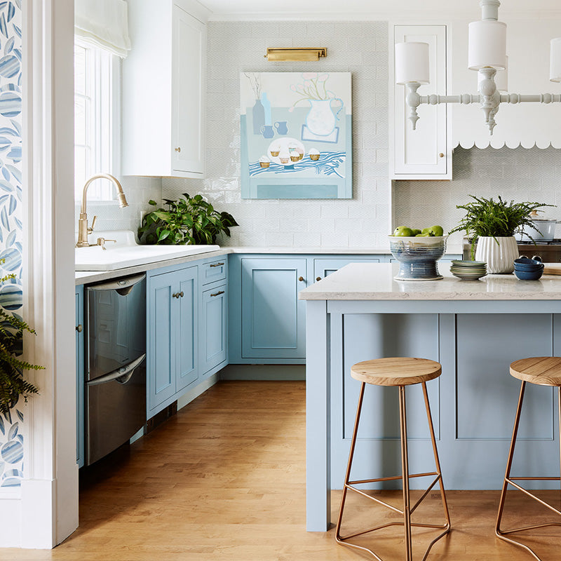
1. FANTASY ISLAND  Whether a kitchen is country French or streamlined modern, kitchen islands are becoming wider, longer, and harder-working. These islands now serve as dining area, prep space, bookcase, storage unit, and display case for art objects. This year, we’ve noticed more kitchens with parallel islands positioned at the center of the room.


2. WIDE OPEN SPACES  An open-plan layout for a home’s entire common space continues to be one of the most frequently requested setups for both single- and multifamily homes. In the past year, open plans have become more evolved and refined. Living-dining-cooking areas feel more organized, with cleaner lines and subtly but clearly delineated zones that underscore differences in function. Design strategies include freestanding built-ins and ceilings of differing heights. 


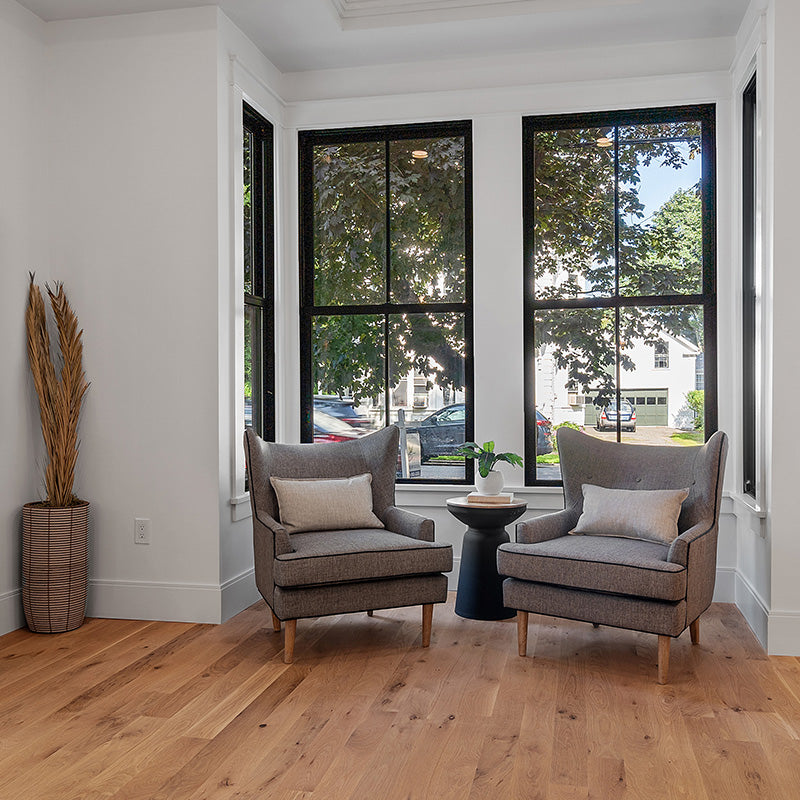
3. ON THE CORNER  Corner windows are increasingly common in homes of all types. Sometimes it’s a second-story bump-out; other times, clerestory. Often the windows are framed, but in more and more instances, they’re not. The corner window trend extends to telescoping window walls on two sides of a patio area. Modern-home designs include corner windows with deftly finished joints that are barely visible, giving the appearance of glazing bent at a 90-degree angle. Finish details like this are impressive, not to mention a great way to add light and spaciousness to a room. 


4. IN THE POCKET  Making smart use of every square inch of a home remains essential. This may account for an uptick in pocket offices: little work spaces in a kitchen corner, stairwell, or hallway that put small but appealing places to good use. Pocket offices are a great way for busy parents to stay at the center of the ac­tion while paying bills or getting work done, and can make smart use of transitional spaces, too. Laptop and hand-held devices enable an office to be anywhere you want, provided there’s decent light, a flat surface, and a place to sit.


5. MOD MADNESS  Classic modern design continues to provide plenty of inspiration. By this time, we know the trend has legs. One architect we talked to says mid-century design recalls a time in design when anything seemed possible; when creativity and originality thrived. Successful mid-century design, he says, is appealing not just because of its clean looks, but because it reminds us of a time when the sky was the limit.


6. INSIDE OUT  Homes that blur the divide between interior and exterior let light in, increase the amount of livable square footage in a house, and make a house live bigger. The trend is nationwide—no longer limited to warm-weather places. Sliding window walls are one of the most popular ways to make an inside-outside room. So is a design strategy we’re seeing more of in multifamily dwellings: Reducing an apartment’s square footage and spending more money on bigger windows. 


7. GIMME SHELTER  While we’re seeing more examples of the outside being let in, we’re also noticing that the inside is being let out. What used to be called a California room is now popular throughout the country. Outdoor spaces are getting more deluxe, with better cooking equipment, nicer furnishings, and fire pits (more on those in a moment). Many of the outdoor spaces we saw this year are built under a lean-to, providing shelter from the elements. A thoughtfully conceived outdoor living space, it seems, can make the difference between selling a home and not.


8. FIRED UP  Builder Online ran a story earlier this year on fire pits and outdoor fireplaces; the slideshow was one of our most popular. Soon after, a survey by the American Society of Landscape Architects showed that fire pits are one of the most oft-requested features for a home’s outdoor living space—second only to outdoor kitchens, and besting a swimming pool by far. Is it that instinctive desire to gather around a flame and toast marshmallows? Memories of summer camp and strumming guitars round the fire? Any feature that helps make a lovely night last as long as possible is fine by us. 


9. UNIVERSAL APPEAL  The popularity of spa vacations has given rise to sleek-looking bathrooms that function as a home’s retreat. One result of bringing the spa vibe home is the wet room: a shower sectioned off by a pane of glass, with a floor that’s a continuation of the rest of the bathroom, sloped a few degrees for optimal drainage. We predict a long life for wet rooms. They’re a practical way to design for American’s rapidly aging population with universal design that’s stylish and beautiful. 


10. PASSIVE AGGRESSIVE    Green design is becoming a matter of course, mentioned in passing, rather than shouted about. It’s also more a matter of individual circumstances and less a question of black or white. As eco-wise homes take on all shapes and sizes, there’s less focus on beefy solar arrays and gee-whiz technology. Instead, we’re seeing more attention paid to Passive House standards. There’s also less emphasis on chasing certification and more time spent on reducing a home’s energy load. One builder in Chicago told us this year that clients send him copies of their energy bills—like baby pictures. (How can you not love that?)


Amy Albert is a senior editor at Builder.
 
For more information call GRAND BANKS 978-281-2421

Leave a comment

Comments will be approved before showing up.